
Five Rustic Wedding Color Palettes Tested for Photos and Barn Venues

For a rustic wedding, we recommend choosing a tight palette of two to three colors rooted in earth tones or fine-art hues, like terracotta, olive, and cream, or misty blue, sage, and oak, then matching the saturation to your venue’s natural textures. Five ready-to-use palettes with hex codes follow below. Before committing, test your swatches in the actual venue light and snap a few photos to see how the colors truly read.
TL;DR:
Choosing two to three earth-tone colors and testing swatches in the venue’s lighting ensures your palette reads accurately in photos.
Rustic palettes like terracotta with olive and cream or dusty blue with sage complement wooden and natural textures and suit different seasons and lighting conditions.
Adding contrast rather than blending into surroundings keeps your colors visible, especially in heavily green outdoor or barn settings.
Testing fabric and paint samples under actual lighting and photographing them helps confirm how colors will appear in person and on camera.
Trending palettes for 2026 favor earth-inspired hues with subtle texture and minimal colors, emphasizing venue textures over complex color schemes.
1. Five rustic palettes you can use right now
A good rustic palette does not need more than three colors to feel rich. Texture, not variety, carries the visual interest, which is why pampas grass, dried florals, and textured linens show up so often in rustic design work. Here are five combinations built for different seasons, light conditions, and venue styles.
Terracotta + Olive + Cream: A warm, sun-baked combination for autumn barn weddings. Use burnt terracotta (#C4603A) on bridesmaid dresses or table runners, olive green (#6B7353) in greenery and ribbon accents, and warm cream (#F2E8D5) across linens and invitation stock. The palette leans on earthy terracotta and brown tones that designers associate with rustcore styling, so it pairs naturally with raw wood and dried wheat.
Dusty Blue + Sage + Weathered Oak: A soft, romantic trio suited to spring and summer barn or vineyard settings. Dusty blue (#8FA3AD) works well on bridesmaid attire, sage (#9CAF88) carries through florals and menus, and a neutral weathered oak tone (#A68A6D) grounds the look in wood furniture and signage.
Mocha Brown + Champagne + Blush: A modern rustic pairing that photographs beautifully against wood and metallic accents. Mocha (#6F4E37) anchors linens, champagne (#D4B896) appears in flatware and candles, and blush (#E8C4C4) softens the florals. Brown family tones like this have grown more versatile across seasons, pairing easily with champagne and warm neutrals.
Deep Sapphire + Terracotta + Silver: A moodier, fine-art palette for evening receptions, especially where velvet or satin textures are involved. Sapphire (#1B3A5C) works as a dramatic accent in table runners or groom’s attire, terracotta (#C4603A) warms the palette against the cool blue, and silver (#B8B8B8) picks up candlelight in flatware and frame details.
Greige + Warm Ivory + Natural Wood: A minimalist rustic approach where texture does the heavy lifting. Greige (#C4BCAF) and warm ivory (#F0E6D8) stay neutral on linens and attire, while natural wood tones show up untouched in furniture, chargers, and signage. This works best when paired with linen, rattan, or raw wood textures that add depth without adding color.
2. How to choose a palette that reads in person and in photos
Start by reading your venue’s dominant tones: the wood, the greenery, the stone, and consult seasonal color combinations recommended by The Ranch at Laguna Beach to guide your floral and color palette choices. Designers suggest choosing colors that add life against these backdrops rather than colors that simply match them, since a heavily green palette against a heavily green venue can visually cancel itself out in photographs. Contrast, not camouflage, is what keeps your colors visible in photos.
Pick two to three colors total and assign each a role: primary, secondary, and accent.
Choose a texture for each color (linen, velvet, dried florals, raw wood) so the palette has depth beyond flat color.
Test paint swatches or fabric samples in your venue’s daylight and again under evening lighting.
Photograph the swatches on your phone in both conditions to see how the colors shift on camera.
Ask your florist and linen rental company about dye-lot consistency before ordering in bulk.
When you tour vendors, ask about their swatch policy, sample delivery timelines, and how closely their florals can match a specific hex code or fabric swatch.
Pro Tip: If your ceremony site is surrounded by heavy greenery, add one punchy accent color or a lighter neutral so your palette holds its definition instead of blending into the backdrop.
3. Applying your palette across florals, linens, and signage
Once you have your three colors, assign roles before you order anything. Your primary color should cover the largest surfaces, like linens or the main floral arrangement. Your secondary color fills complementary pieces like napkins or bridesmaid dresses, and your accent color appears only in small details.
Ask your florist to mix living and dried materials, and keep your accent color small so it does not overpower a neutral-heavy palette.
Request a test bouquet before the wedding day if your palette depends on a precise color match.
Choose textured fabrics, like linen or waffle weave, when your palette is narrow, since texture adds visual depth that a flat color alone cannot.
Watch for dye-lot differences between rental batches, especially with custom linen colors.
Remember that warm bulb lighting and copper or bronze accents can shift how a color appears, so review your palette under the lighting you will actually use.
A quick example: with Terracotta, Olive, and Cream, your bouquet might lean terracotta with olive greenery, your napkins stay cream, and your welcome signage uses all three in a simple hand-lettered layout.
4. 2026 trend signals affecting rustic palettes
Color trends heading into 2026 lean toward fine-art inspired tones, deeper greens, and earth-based neutrals, with brown emerging as an alternative to classic black and white pairings. Planners are also recommending smaller palettes of two to three colors, letting texture and metallics create depth instead of adding more hues.

Rustic wedding style itself remains a consistent favorite: 15% of couples surveyed in the 2025 Real Weddings Study identified rustic as their wedding style, making earthy, textured palettes a safe long-term choice rather than a passing trend.
If you want a 2026-forward look without risking a dated feel, build your foundation from a timeless earth-tone pairing and add just one trend-driven accent, like a deeper jewel green or a fine-art plum.
5. Venue-focused inspiration: testing palettes at a barn venue
A barn venue’s wood tones and natural mountain light shape how any palette will actually look on the day. Indoor spaces with warm bulb lighting and exposed wood tend to favor a Mocha Brown and Champagne pairing, while an outdoor ceremony with mountain views often calls for Sage, Misty Blue, and Oak to stay grounded without disappearing into the scenery. When you tour a barn venue, bring physical swatches and photograph them in a few different spots and lighting conditions before locking in your final choices.

6. The psychological and emotional impact of rustic color palettes
Color shapes how a wedding feels before a single word is spoken. Earth tones like terracotta, olive, and oak tend to read as warm and grounded, which is part of why they pair so naturally with the relaxed, unhurried feeling many couples want from a barn or countryside setting. Cooler combinations, like dusty blue and sage, often carry a softer, more romantic mood, well suited to a quieter morning ceremony or a garden-adjacent reception.

Deeper, fine-art palettes, like sapphire paired with terracotta and silver, tend to feel more intimate and dramatic, which makes them a natural fit for evening receptions lit by candlelight or string lights. Minimal neutral palettes, by contrast, tend to feel calm and timeless, letting the venue’s own textures, wood grain, stone, and greenery, carry the emotional weight instead of the color itself.
None of this is about rigid rules. It is about recognizing that a palette is not just decoration. It is the visual tone of the entire day, and choosing one that matches the feeling you want guests to walk away with is often more important than chasing whatever is trending that season.
7. See these palettes come to life at Mountain View Menagerie
We would love to help you test these palettes in person. Our barn’s wood tones and sweeping mountain views offer a natural backdrop for earthy and fine-art color schemes alike, and our Wedding Packages include decorations and seating to help your chosen colors shine.
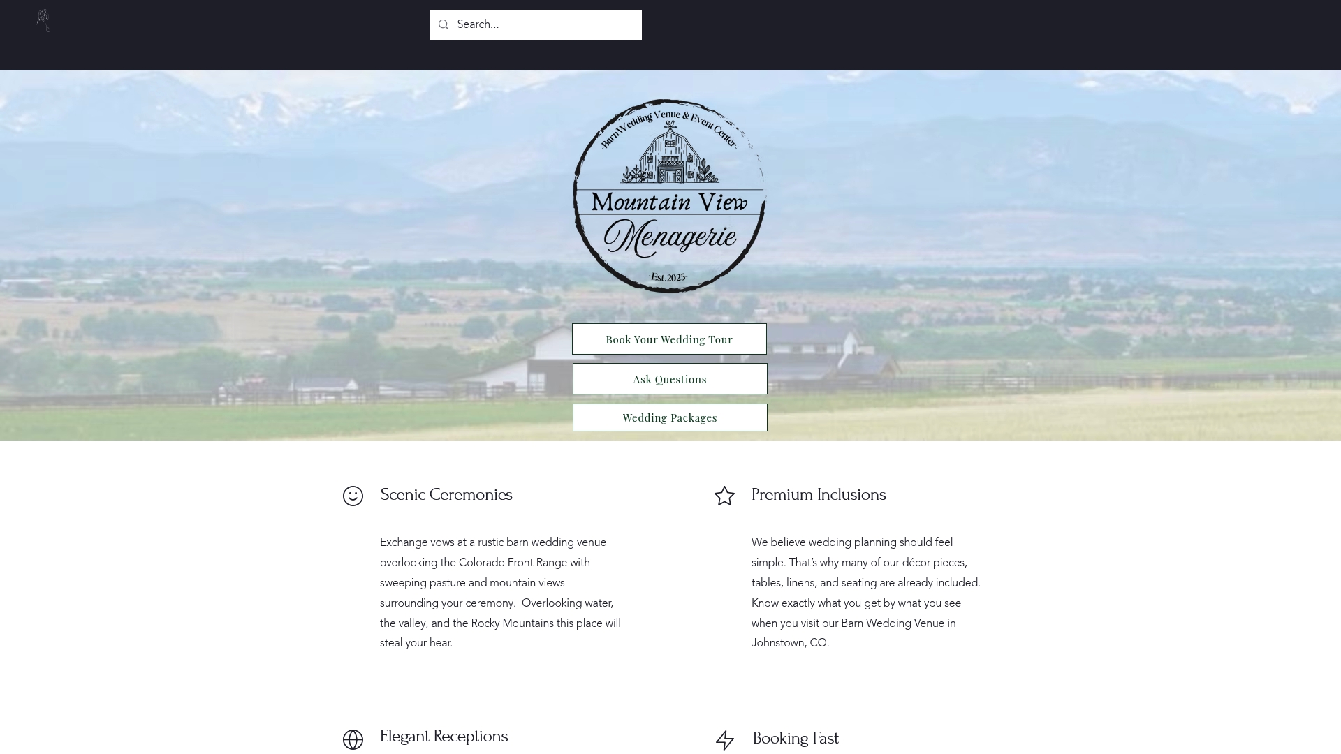
Browse our barn wedding packages to see what is included.
Ask about our Beer Burro Experience, a unique add-on for your reception.
Schedule a tour to bring your swatches and see how they look against the barn wood and mountain light.
FAQ
What are some good colors for a rustic wedding?
Earth tones like terracotta, olive, mocha brown, and warm cream are popular choices because they pair naturally with wood, greenery, and dried florals. A two to three color palette keeps the look cohesive without competing with the venue’s natural textures.
What colors complement rustic styles?
Rustic settings tend to favor warm neutrals, muted greens, and browns that echo wood and natural materials already present in a barn or outdoor space. Designers often recommend choosing colors that add life against the venue rather than blending into it, especially in heavily green outdoor settings.
What are the trendy color palettes for weddings in 2026?
Wedding color trends for 2026 point toward earth tones, deeper greens, and fine-art inspired hues, with brown rising as an alternative to traditional black and white combinations. Smaller palettes of two to three colors with added texture are a consistent recommendation this year.
What are the three best color combinations for a wedding?
There is no single definitive ranking, but reliably strong combinations include terracotta with olive and cream, mocha brown with champagne and blush, and dusty blue with sage and natural oak. Each pairs well with rustic textures like wood, linen, and dried florals.
How do I know if my palette will photograph well?
Test your swatches in your venue’s actual daylight and evening lighting, then photograph them on your phone to see how the colors shift. This quick, practical step is commonly used by wedding professionals to confirm a palette reads correctly on camera before committing to it.
Sources
Recommended
Comments